Boosting Your eCommerce
April 28, 2014 2:09 pm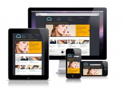 If your selling and marketing anything through your website and you’re site is not optimized for mobile or tablet, you’re behind – big time behind. Recent stats from 2013 Black Friday sales show that 40% of shopping was done using mobile/tablet. Shopping now is about convenience and research. Whether consumers are checking prices, sharing purchases or possible purchases to social media, and an eCommerce site is missing the boat if consumers cannot do most all of it through their mobile/tablet devices in a seamless fashion – no pun intended.
So, what options do you have to get caught up on the latest shopping trends and eCommerce functionality? It really all boils down to a mobile optimized site, a responsive designed site or an app. Here’s the difference between each one:
Mobile Optimized
This means a few things. Mainly that your site it configured in such a way that it picks up when a visitor is coming from a mobile or tablet and adjusts the view to be optimal to fit a smaller size screen. This may mean a decent portion of your home page is visible in a smaller format to users or that a small amount is available with an additional menu then displayed for accessing the rest of the site and interior pages individually. Many times an optimized site is flexible for only one page orientation (landscape or portrait). Part of an optimized site usually also includes some additional SEO (search engine optimization) settings to complement the optimized pages. Of the three options, this is typically the least expensive and considered a good option for sites that aren’t necessarily using a site for eCommerce, but a digital marketing asset tool and needs to be accessible to all users.
Responsive Design
This approach requires a design that is capable of responding to any size device and orientation (landscape or portrait). The design and full functionality of the site is always available, regardless of the hardware used to access the site – desktop, mobile, tablet etc. Responsive designs require more design consideration and site planning, based on it’s flexibility. As a result this option costs more and is considered ideal and premium for any website, including eCommerce. Typically, responsive designed websites also have a very targeted marketing approach and message. Content is focused, lean and effective.
App
Most websites will fit within the two options above, however you may be in the market for an app, after considering a few things:
- Will my app provide a function or tool that is not available on the website?
- What is my current mobile/traffic on my website and does it warrant an app consideration?
- Will an app make a certain functionality that’s on my current website easier to use or speed up a process?
- Are there certain values, discounts, benefits for users to gain access to by using the app, rather than the website?
If any or several of these answers are yes, then you may be a good candidate for web app development. Be honest when answering these questions. If they are a no or almost all no even just one is a yes, then you probably shouldn’t waste time and money on an app, as most users will want these benefits if they are going to download your app. Apple, in particular, may challenge the acceptance of the app through their store if it’s deemed to not have much value in some of these key categories. Additionally, this will be another digital marketing asset to monitor and update as time goes on, in addition to your website.
Turbine exists to help navigate these waters, so give us a holler if you have any questions. For a bit more information on eCommerce and some things to consider, check out Mashable’s article, http://mashable.com/2014/04/23/ecommerce-retail-trends/
Categorised in: App, Consulting, Digital, Marketing, Turbine, Web


Comments are closed here.